How are we tracking on demand generation and bookings this quarter?
Never show just a moment in time when you can show a time series
The CEO asks, “How are bookings looking, and are we tracking the way we should?” How do you answer that question? How do you know if you’re tracking the way you should be part-way through the quarter? The same question can be asked about demand generation: “Are we on track to build enough pipeline this quarter?”
There are a lot of assumptions to unpack in those questions and I’ll cover them in detail across several posts – but let me share a few things that I think are important when thinking about these things.
First – to really understand how you’re doing in bookings or demand generation you need to be looking where you are against a target in a time series – not just a standalone number at a moment in time.
Say for example you had a demand generation target of $108M in the quarter. You might present a table that looks like this.
So, if you are in week 10 of a 13-week quarter (77% of the way through the quarter) and you are at 54% of the total target – is that a good thing or a bad thing? If that’s all of the data you really see – the answer honestly is “we don’t know.”
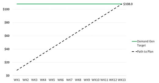
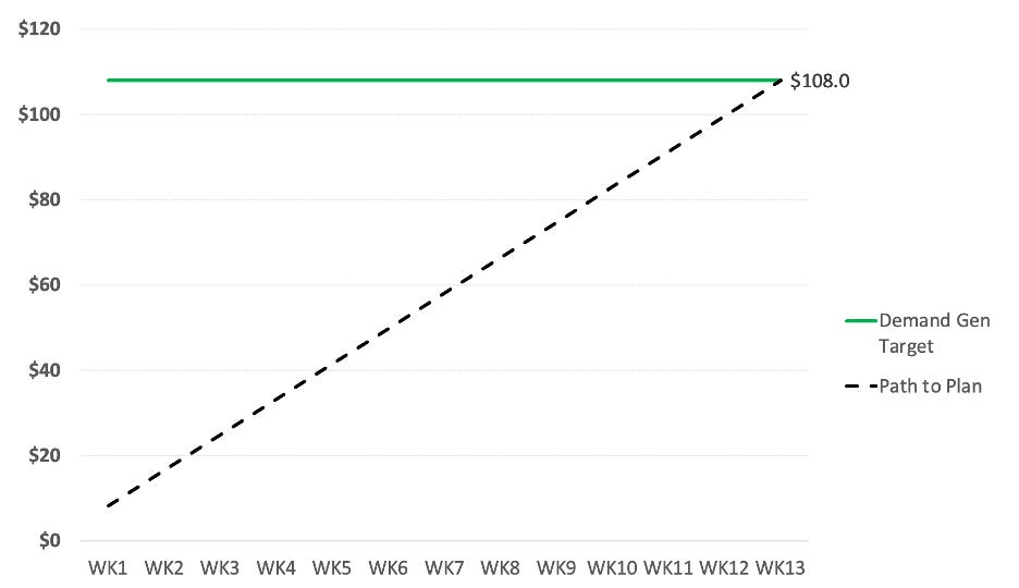
When companies are first starting out (and data is limited) – they make an assumption that demand generation might be linear through the quarter. If you were to look at how you would expect demand generation to come in – it might look something like this:
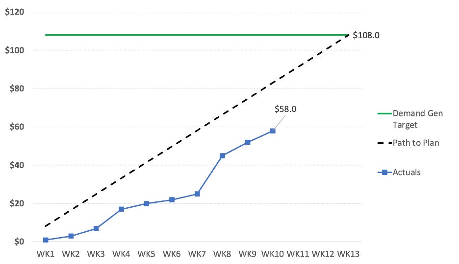
That’s a good start – you know what the target is – you know roughly where you should be throughout the quarter – so if you now plot the actuals against the target – you might get something like this.
You would look at that and think wow – I’m definitely trending behind – and if your demand generation truly came in linearly – you would be. It becomes obvious from the first few weeks in the quarter that you’ve been behind and the gap is not closing. Something is wrong and you need to figure out what is going on.
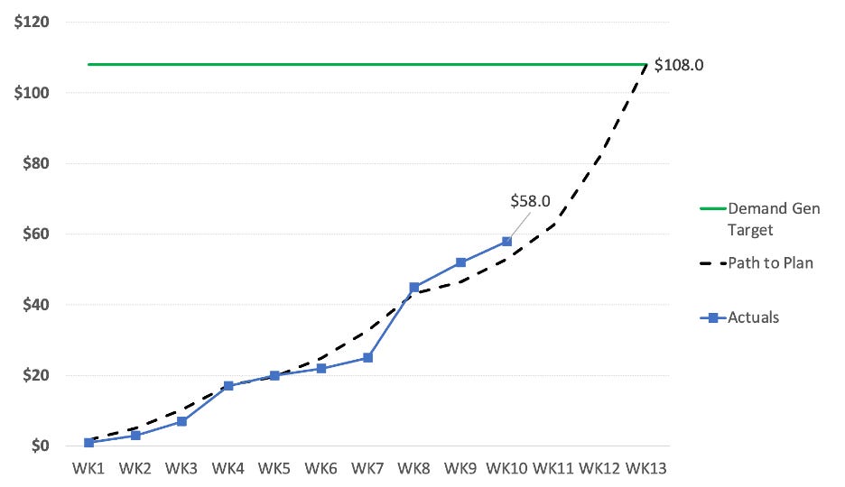
But – demand generation typically doesn’t come in linearly. Each quarter is a bit different due to seasonality and other macro-economic factors that are happening in your business. Over time – you get to understand the typical patterns of demand generation (based on historical data) – and you can estimate a curve as to how it will come in. In this example – one of the things you’ll notice is that a significant amount of the demand generation comes in during the last three weeks of the quarter.
So now if you plot those actuals out on a more realistic (and estimated) demand gen curve – it might look something like this:
This tells a quite different picture – and while the company hasn’t been beating the target every week consistently – at least as of week ten it’s ahead of where it should be (in this case it’s at 110% of the “path to plan” and in good shape. Presenting the data this way shows a much better picture than a static row of data and gives you context and insight into what’s happening in the business.
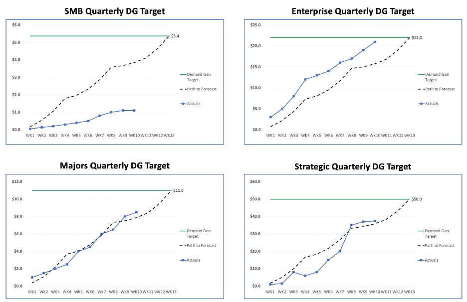
Most of us have more than one sales segment, and we have more than one source for demand generation. We set pipeline targets by sales segment and by source (e.g. marketing, channel, self-gen), and we further break down targets into sales segment by source so that we can really dig into what’s working and what’s not working. Why is this important? Here’s a simple view looking at just pipeline created by sales segment across the quarter. If you were to only stick to the view above, you might say that everything is on track – but when you peel back the layers – you start to see here that the SMB segment is significantly off track and given the lateness in the quarter – it’s highly unlikely you can get it back on track.
The power of doing something like this is you can see very early on (say week 2 or 3) if things are on track, and you can try and take course corrections early in the quarter. That’s what we did in this hypothetical strategic example in the bottom right – started off OK and then fell off so we would look at what actions we could take (engage channel partners, do a different SPIF with the BDR’s, etc) to get it back on track.
Make sure that RevOps and all the DG teams (marketing, channel, BDR’s) review this every week in detail, and then summarize it for senior leadership with insights and actions.
Couple of other quick notes I’ve found helpful:
1) To be able to easily compare quarters both within a year and across years – I typically normalize every quarter to be 13 weeks. You’ll sometimes end up with an extra day in the last week of the quarter (so it’s an 8-day week) – but it’s a trade-off I’m willing to make to easily do comparisons. You might also end up with a shorter week (6 days). I don’t care what day of the week the first day of the quarter is (e.g. Sun, Mon, Tue) – whatever it is it is – and I take the first 7 days from there as week 1. The next 7 days as week 2. I know some people always want to start the week on a Sunday but that makes life difficult for tracking. Let’s say the first day of a quarter is a Thursday – so what you’d end up with for week 1 is a stub week (Thu, Fri, Sat) and then week 2 starts with that Sunday. This really makes the numbers look funky. This approach works around that problem. If you’ve got a better solution – I’d love to hear it, but I’ve found that this works great to compare across years and within the year.
2) Learning to extrapolate the path to plan curves is both an art and a science. For demand generation – if you have multiple years of history – that’s the best. If you don’t have multiple years of history - take what quarters you do have and try and extrapolate from there and learn as you go. When it comes to bookings forecast path to plan – I will also look at the projected close dates in salesforce and may tweak the curve for the quarter (earlier or later) depending on how the deals look and give historical curves and the potential bookings dates a weighting and do a combined version. Again – art and science. There are third party tools out there that can help, and I’ll cover some of those in a future post.
Hope you enjoy this post and if you have questions or comments – please ask! And as always – here’s Ollie (from a few years ago playing in the snow).

