If a picture is worth a thousand words, what is a well-constructed chart worth? To quote Mastercard: priceless. This post isn’t specific to RevOps – it’s really for anyone creating charts. I was updating and reviewing a number of demand-gen and pipeline charts this weekend for our weekly update deck - and was thinking about this post as a next topic. Then I was in a meeting today and realized that I absolutely had to put pen to paper.
There are a lot of blogs and YouTube videos on how to make good charts, and I encourage you to search them out if you spend a lot of time creating them. This isn’t meant to be the definitive guide to chart making (I’m not going to spend any time talking about how to choose the right type of chart for the underlying data) – I just want to share a couple of principles that I think apply to any chart you might make.
Here are a couple of hard and fast rules that I personally think every chart should have:
A title. What’s the content of this chart? I can’t tell you how many slides I see where there’s a chart and it’s almost like you’re expected to guess what the content is. Tell the reader what the chart is. Make it absolutely crystal clear.
Label the axis: what are your units? Are they in thousands? Millions? Years? Something else? Don’t make the reader guess.
Start the y-axis at zero. If you are starting from something else – it can really distort the picture. Maybe there’s an important point to make – but you don’t want the reader to draw the wrong conclusions.
Font size on the axis and data – make it a minimum of 14 point. You want charts to be instantly readable. You don’t want your readers to squint or guess if that’s a “o” or a 0.
Put the legend on the right hand side. There may be times you want the legend to be below depending on overall formatting – but I’ve personally found that putting the legend on the right-hand side makes it easier for your readers to decipher your chart
If you can put actual numeric data on the charts at selected points – do it. Make it easy for your reader to really get insights from the chart.
Pick the right time horizon for the graph. If you are showing a time series and the typical measurement period is a quarter – show an entire quarters worth of data – not a subset.
Last – any published chart with all the right info should be able to be read by any knowledgeable reader without having to have someone to explain it. The core insights should jump off the page. If you haven’t checked out The Economist lately – go check out their charts – they do an amazing job of conveying complex information in a very clear and easy to read manner.
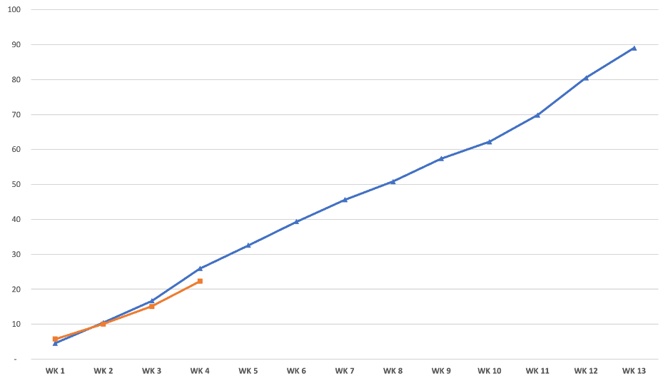
Let me walk you through why these things are important. I was in a meeting recently and saw a chart like this on a page (no labels – just a chart):
Literally – that was the chart on the page. No title, no legend, nothing. It required the presenter to walk us through what the topic was and also what each of the lines meant. When I first got this deck I had no idea how to interpret the slide of what conclusions to draw from it.
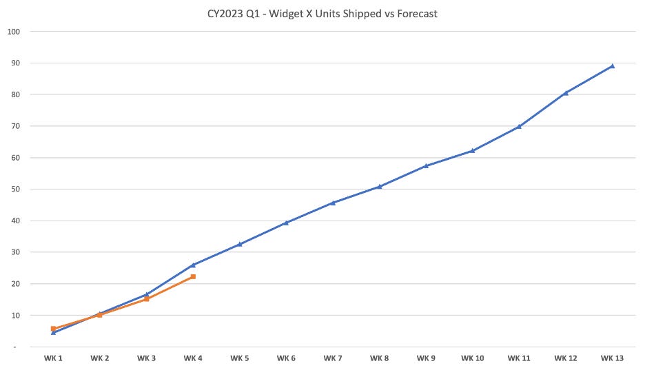
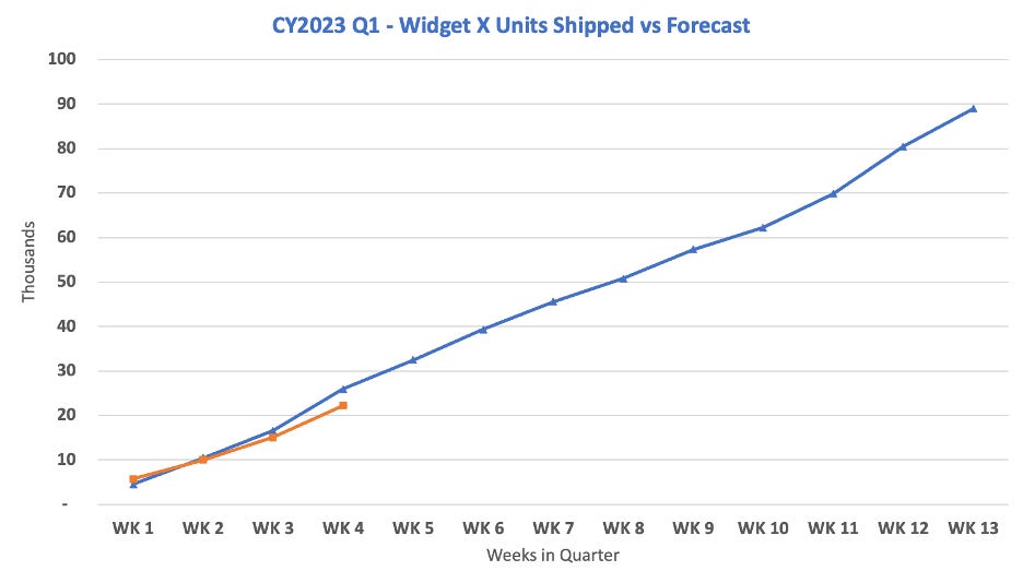
Let’s talk about each element one at a time and see how it all comes together. First – the title.
OK – this is a bit better because now I clearly know what this chart is about. It’s about how many units we’ve shipped against the forecast. Looks like we’ve shipped around 21 or 22 versus a forecast of 25 or so assuming we’re on week 4. It’s pretty obvious that the X-axis is Weeks (WK 1, WK 2, etc) – but what is the Y-Axis? Is it really units?
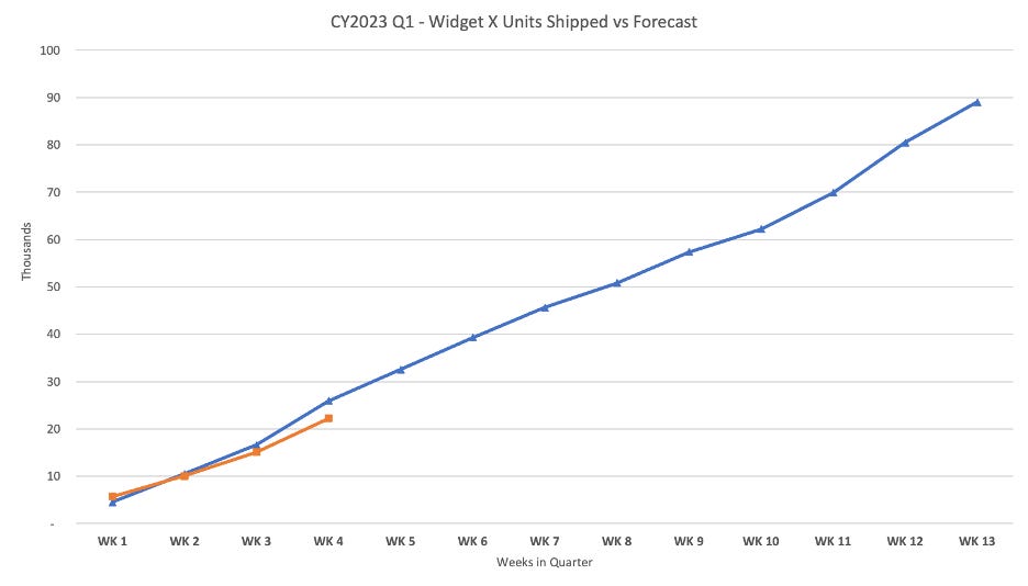
Looks like we were right about the weeks in the quarter, but wrong about the Y-axis. It’s units in Thousands.
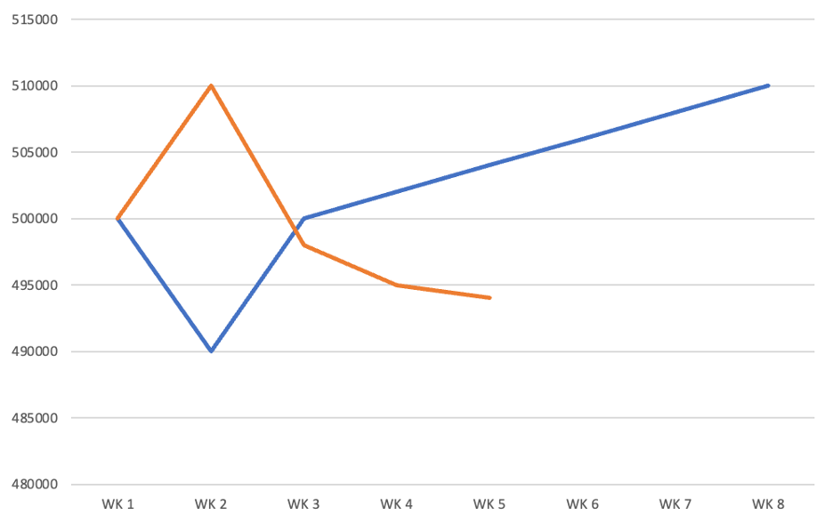
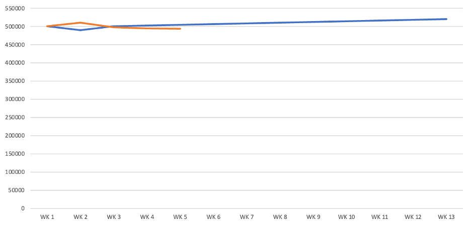
I’m going to divert from this chart for a moment to show an example of how changing the y-axis can provide very misleading numbers. This is very similar to a chart I saw today. At first glance (assuming the orange is actuals – but again there was no label) my first thought was “uh oh” – this is really bad. We started strong, but heading in the wrong direction and in for a huge miss.
Then I realized two things: 1) The y-axis doesn’t start at zero. Maybe these differences aren’t nearly as big as I think they are and 2) This isn’t showing a full quarter – maybe there’s something else going on I need to be aware of. When the x-axis and y-axis are adjusted appropriately – the chart looked like this. That’s a very different picture from what we saw in the first chart. Appropriate scaling really matters. 😉
OK – so back to the original chart. Setting the font size for the Axis and titles matters a lot. I typically set a default size of at least 14 on each chart axis for readability and bolded them (but not the labels). You can see how much cleaner this version is (I did make the title 18 and bold and blue):
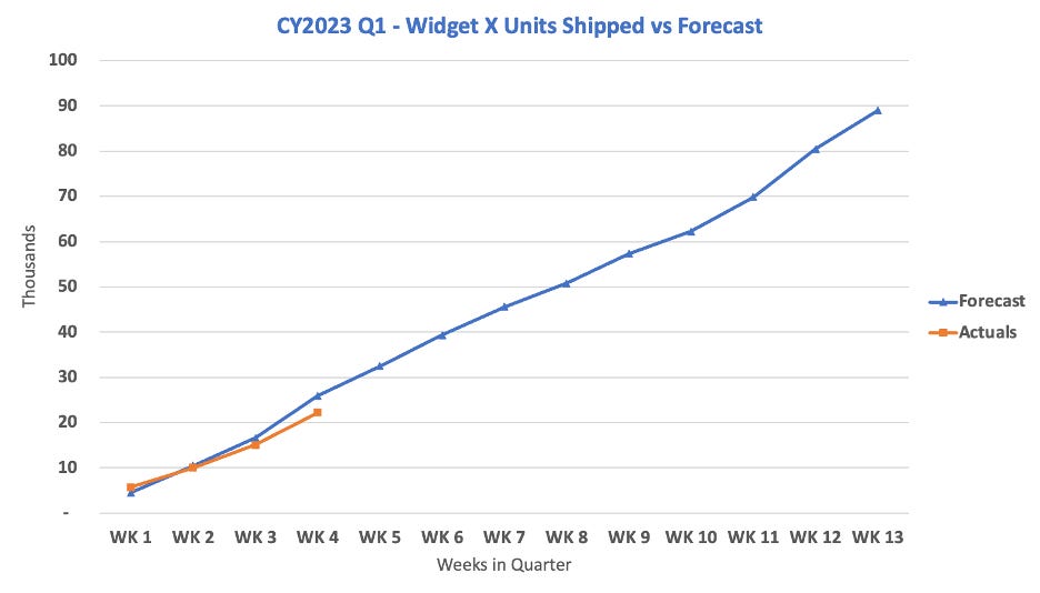
Now I added the legend at the right-hand side for additional readability:
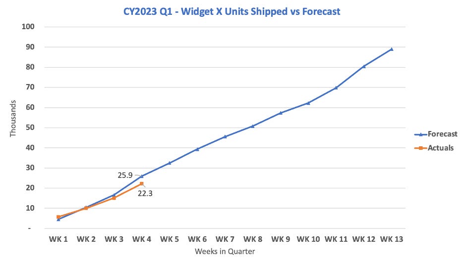
The last thing I added in this example are the units on the chart so you can clearly see the actuals vs forecast (versus having to try to guess).
Here they are side by side to easily see the differences.
Like I said – this post is a bit of a diversion from my normal topics. I see so many bad charts I need to write a little something about it. I know that mine is not perfect – but hopefully it’s significantly better than the starting point. You need to keep the end reader in mind. Can they easily read the chart and get the insights you want to share without you having to explain them. If they can – you’ve done a great job at doing the charts.
For those of you who want to go deeper into chart design – the “godfather” of good chart design is Edward Tufte. He wrote several books on the topic including The Visual Display of Quantitative Information. I have no affiliation with him at all, but I can tell you his books and in-person classes are amazing. If you are into good chart design – start there.
I know this one was a bit off the RevOps topic, but I hope you found it useful. I also know that the x-axis label should probably have been “Week in Quarter” vs “Weeks in Quarter” but it was too late to reproduce all of the charts.
Please let me know what you’d like me to write about. Coming soon will be SPIFFs, Comp Plans and Territories.
As always – ending with a picture of Ollie who needed a rest after he got cleaned by the groomers.
Best,
Steve


